So I kind of lost count of what day this was. Somewhere around March 23. This is a view of the garage (obviously). There will be three cedar posts with stone base under the overhang.
This is a view of the front of the house. Window to the left is the garage. Window to the left of the front door is the dining, and window to the right of the door is the playroom. Another view of the front from a different angle.
This was a nice surprise we found after purchasing the property - a field of buttercups! I posted about them last year. They are my favorite flower (note my blog page title). They are a wonderful preview that Spring is on its way!
The back of the house. For some reason, they didn't cut the plywood to the full size of the windows. The forklift is sitting in front of the french doors that will lead from the great room to a patio. The covered patio is off of the kitchen and breakfast area.
Another view of the covered porch, and again, windows have not been cut to correct size yet.
The side of the house. Window on left will be den and window to right is son's room.
View from covered porch. Stone fireplace will be where bump-out is.
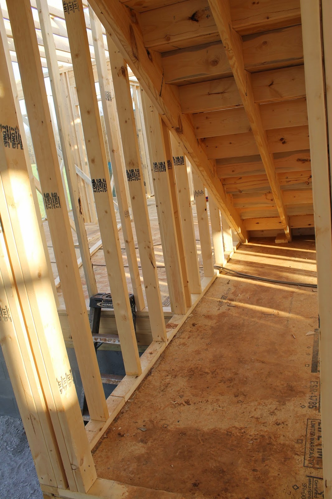
My daughter loved that we had stairs that at the moment lead to nowhere.....
except a good view.
The future bonus room.
Looking into kitchen from breakfast nook.
Storage for
Looking into garage. We had no idea that the slope of the land was this substantial. It really looked quite flat. There will be about 5 steps leading down into our garage. I'm not really happy about that but the alternative was to flip the entire house plan, which would completely change the views from windows. I'll deal with the steps.
Looking into great room from dining room. Patio doors in middle flanked by windows on each side.
I have obsessed over the original plan, modifications we made to the plan, and our revised plan for months (I'm talking 24 or more). I thought it was perfect. Like there was nothing we would change. And then they framed it. And then I realized, with the help of my husband, that we had a really small master bath and a decent amount of wasted space next to it. In the original plan, I wanted some separation between the bath and the WIC (labeled Hall in the blueprint below). I bought a beautiful little chandelier to go in that area. There is a small window at the end of the hall, and I had visions of a dainty little dresser to hold my jewelry. Pretty right? And then I saw the size of the vanity area in the master bathroom. It was about the size of a pedestal sink, and I realized it just wouldn't work.

Here's my fix: extend the vanity on the exterior wall to the wall of the WIC, eliminating the partial wall of the cased opening leading to the MB.
Now for problem two- the windows had already been ordered and while we could place a second order, I wanted to save time and money. The master has two transoms in it, one in the shower and one over the sink on the exterior wall. We'll eliminate the transom in the shower and move it to the new location of second sink. Imagine something like this with a transom above each mirror.
Or maybe something like this with a transom above each mirror. I can't decide if I like the storage or the vanity. ? ?
Here's the area framed. Standing at the double doors entering the Hall from the master. Bye bye pretty little area with a chandelier. . . : - (
Remember me saying that the vanity area was small? Well, this is it. It will now be changed to a small linen closet to provide some much needed storage for the bathroom. Another thing I felt sure we could live without but will probably be happy to have.
Another picture of the area that was to be my pretty "wasted space" with a window and the original transom over the sink to the left.
Onward to the next problem. . . the powder room. An oddly shaped little room. . . with a niche I'm sure I would hate. So when we decided to do away with the niche, it only made sense to straighten the wall. I've drawn a line to show where the new wall will be. The only thing we lose is an interior corner of a cabinet in the kitchen. This change should also allow us to put the pedestal sink and toilet on the same wall.
I'm also hoping that by eliminating the niche and straightening the crooked wall we will be able to brick the walls of the powder room. Here's my inspiration pic:
http://www.houzz.com/photos/11524176/Pinebrook-rustic-powder-room-other-metro
And now to something that didn't need changing (not yet anyway), the covered porch. When the foundation was poured, this was one of two areas that I didn't think looked small (the other area was the master closet).
This is the front porch.
That's it for now!


No comments:
Post a Comment